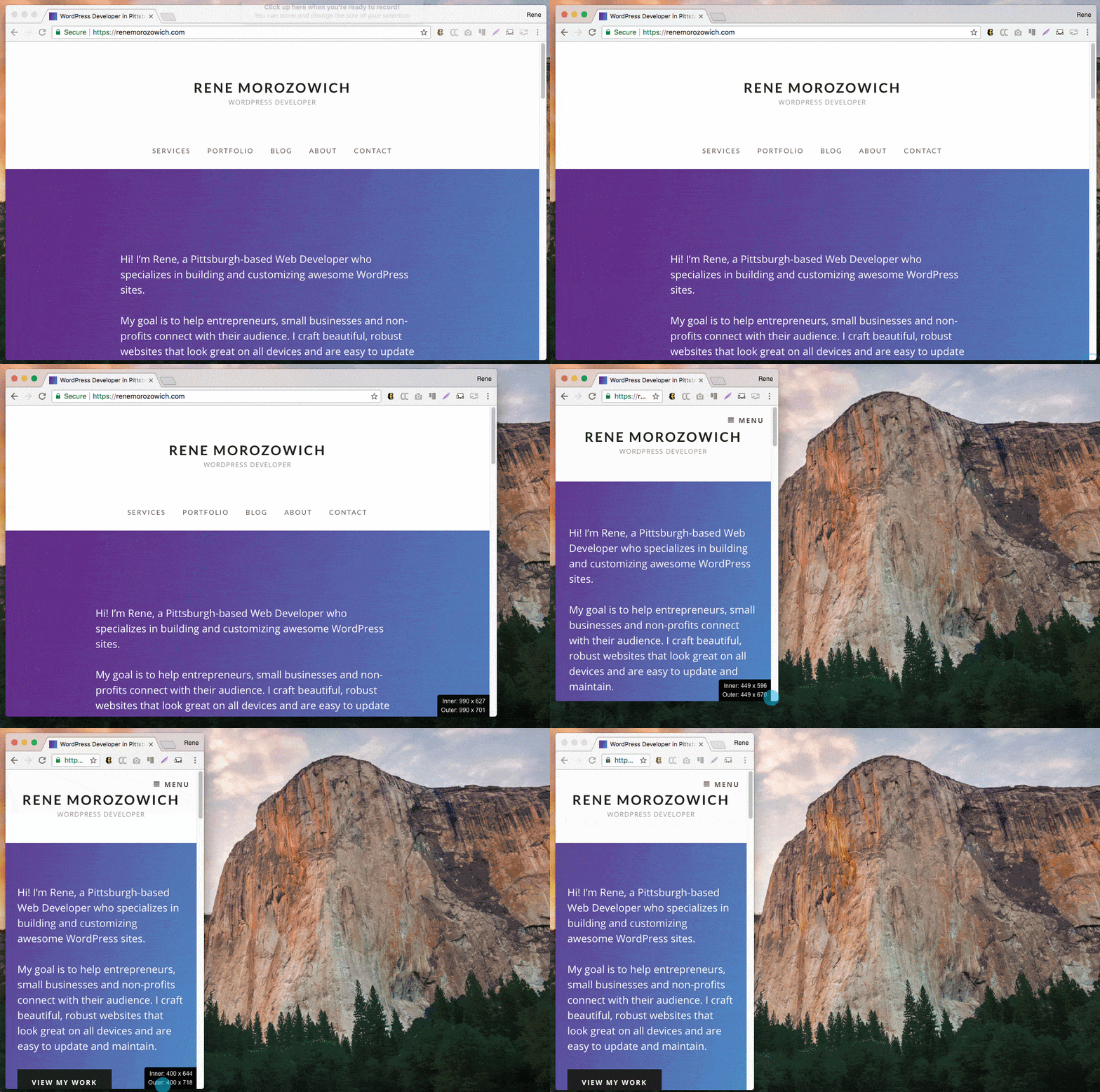
Responsive web design. RWD. You know, when your site looks great on your desktop, tablet AND mobile device.
It’s important, for sure. Your viewers are using a variety of devices to view your site (check out your sessions by device in Google Analytics). And Google’s algorithm gives priority to websites that display well on smartphones and other mobile devices.
So how do you know what your site actually looks like on all those devices? You should test on as many devices as you have access to (or your friends and family have access to), but short of that, there are some awesome online tools you can use.
Here’s a roundup of my favorite responsive design checking tools:
- Responsively is a desktop app that shows your site on any device you choose. What’s awesome about it is that you can scroll simultaneously, take screenshots and more.
- ami.responsivedesign.is is a quick overview tool that allows you to see your design on four different devices. I love that you can reorder the devices in the image just by dragging them to a different location. (Here’s what my site looks like!)
- responsivedesignchecker.com allows you to choose desktop, mobile or phone and then from a list of popular devices.
- responsinator.com is a bit more limited, but sometimes less options are better. Once you enter your URL, it shows your site on just a few popular devices. Nothing to choose from + everything on one screen.
- responsivechecker.net is similar to responsinator.com where it shows you just a few devices, however you can choose from what seems to be a list of every device ever.
- mattkersley.com/responsive doesn’t allow you to choose devices, however you get to see your site at a variety of different (and common) widths.
- Emmet Re:view is another extension. Open your site and click on the extension button. From the device wall, you can choose from a variety of different devices.
My favorite, though, is probably just old school resizing the window.
Make sure your window is “restored” (i.e. NOT full screen), then use any corner and click/hold/drag to resize. Like this.

(Shoutout to the Chrome extension Viewport Dimensions that shows the dimensions on the bottom right of the browser when I resize it. Because sometimes I just need to know what size the screen is when something looks weird.)
Another super secret trick I have is using a smaller monitor. I have a 13″ laptop that’s my primary device, and it’s come in really handy more times than not. Lots of sites look great on a HUGE monitor, but I can check design on a slightly smaller monitor and have uncovered (and fixed) issues that I wouldn’t otherwise have seen without more rigorous testing. So I guess sometimes bigger isn’t better.
How is your site looking on tablets and mobile? Go check it out!
