Today we’re going to look at 29 different examples of sign up forms — forms asking a visitor to sign up for a newsletter or to receive a free resource.
There’s a ton we can learn from these by looking at where they’re located, what they contain and what they promise.
(Just for ease, I’m going to cover these by location.)
Home page
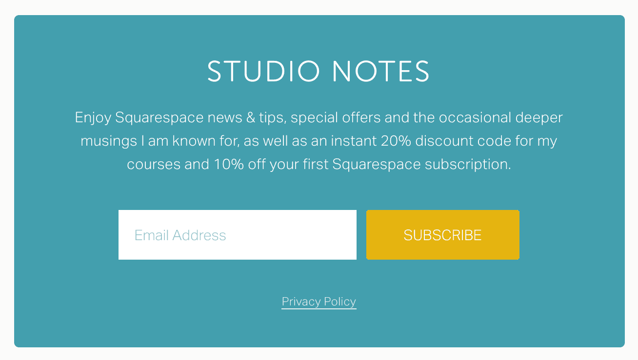
I see a lot of sign up forms on the home page, generally in a panel near the bottom. A heading, description and short form works well.
In these examples, we see a promise of news/tips, tutorials, special offers and coupons. Some also pique your interest with an “inside look” or pull at your heartstrings by asking you to “join the community.” And lest you feel like you’re missing out, you should definitely join the <very large number of> other subscribers already on the list.
Takeaway: Use persuasive language to entice the visitor to sign up.


Sidebar
The sidebar is another really common place to add a sign up form to your site (if your site has one).
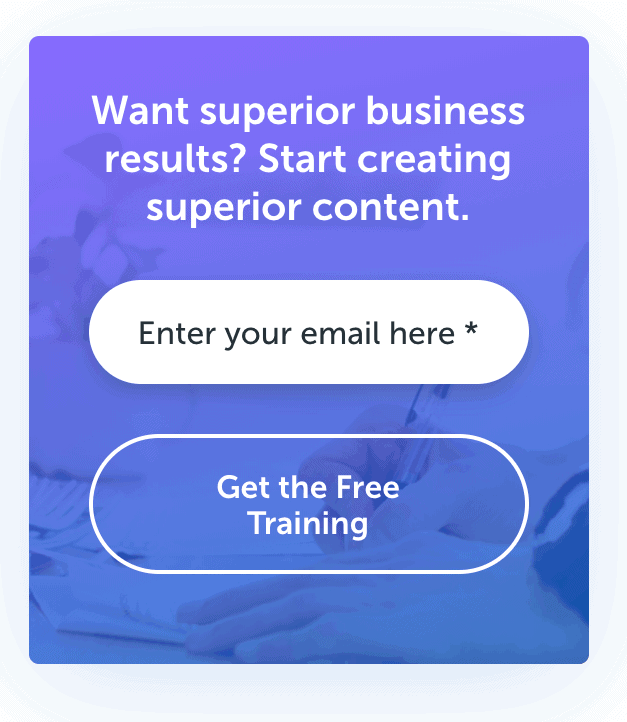
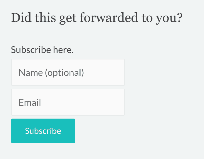
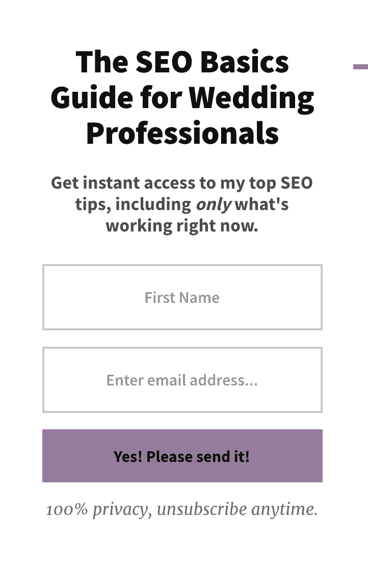
In some of these examples, we’re being asked to subscribe to the newsletter or receive the blog via email. In others, we’ll get access to free training on how to create superior content or an SEO basics guide with top tips.
Takeaway: Make it really clear to the visitor what they’re signing up for.
Above individual posts
If you have a blog, a great place to add a sign up form is above each post. You don’t have to do this manually, rather add it globally in your theme so that it shows up every time.
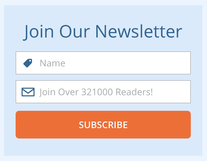
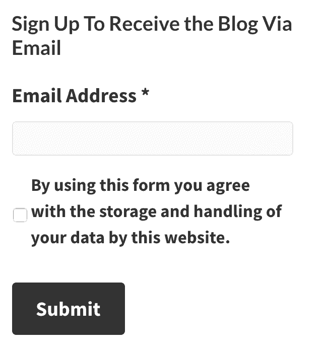
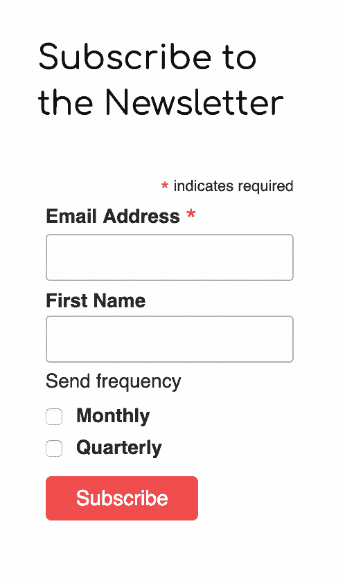
In many of these examples, the signup form is super quick — email address and possibly name, but nothing else.
Takeaway: Make it as easy as possible for people to sign up.


Below individual posts
You can also add a sign up form below each post with the thought that if the visitor reads the post and likes it, they’ll be more likely to sign up for your list at the end.
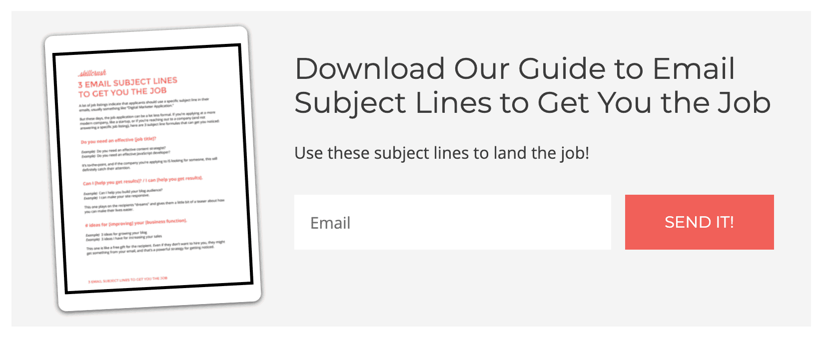
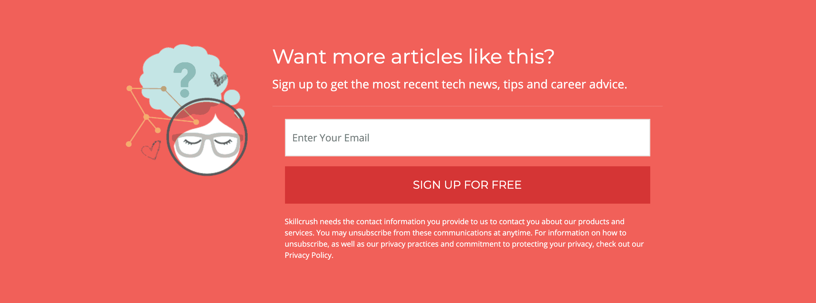
This is the first time we’re seeing a duplicate sign up area — CopyBlogger, Skillcrush and Lockedown SEO all have sign up forms elsewhere on their site.
Takeaway: Don’t forget the importance of giving visitors multiple ways to join your list.
I also like that we’re seeing some variety in button text — Get the Free Training, Sign Up for Free and Sign Me Up! In a lot of the previous examples, the button text simply said Subscribe, which isn’t super interesting.
Takeaway: Make the button text compelling.




Footer
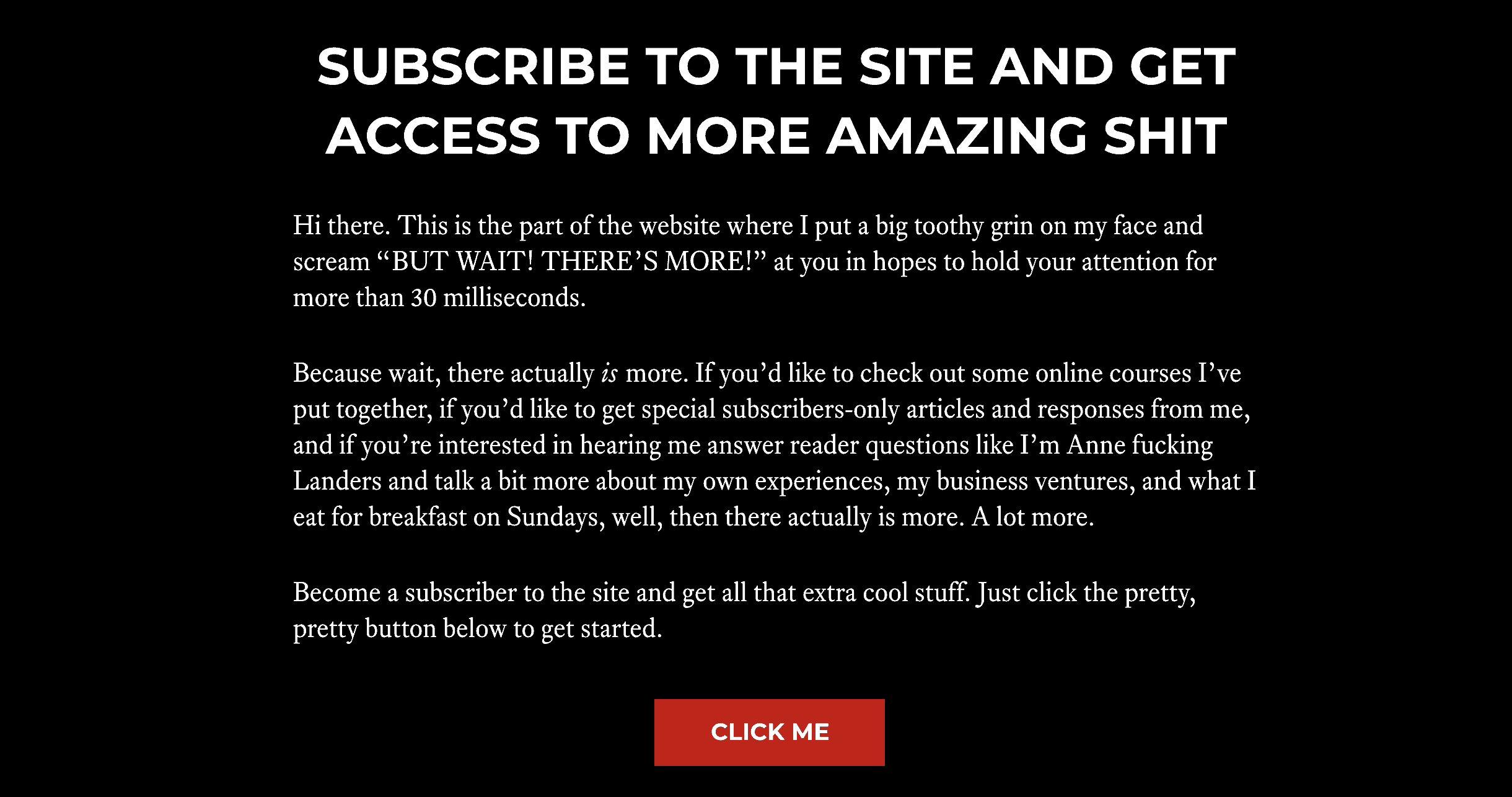
You can also add a sign up form in your footer. The footer is great because it shows on every page, so no matter where they are, visitors will be able to sign up.
In these examples, there is no form to fill out, simply a button to click — in the first case, a popup appears and in the second, we’re taken to a dedicated page. (It’s actually a sales page, as Mark’s subscriber content is paid.)
Takeaway: Try a button to a popup or dedicated page.

Screen overlay
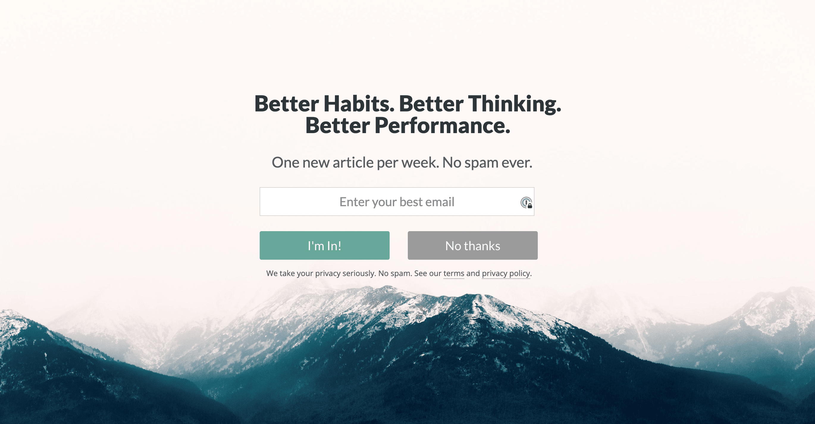
Screen overlays are pretty neat. Think popups, but cooler. You’ll be visiting a page, sipping your coffee and reading the content when all of a sudden, your screen turns into a sign up form.
Because you can’t see any of the page where you were, you’re forced to deal with the request. I love that some of these show two buttons — one to join in and another not to join in.
Takeaway: If possible, have an additional button to not sign up with text that makes the visitor think.

Other creative places
We’re not done yet! Here are a few last places you might see a sign up form.
Top bar
Some sites show a top bar call to sign up. Like with the footer, the top bar should show on all pages. I also like that it’s front and center on the site, however you don’t have much real estate to work with, so choose your words wisely!
Takeaway: Be concise with your message asking the visitor to sign up.


Slide in
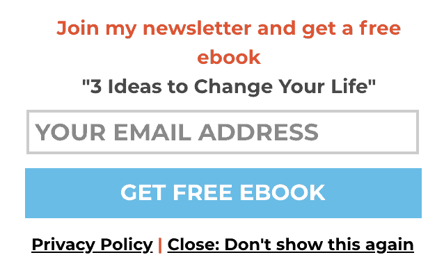
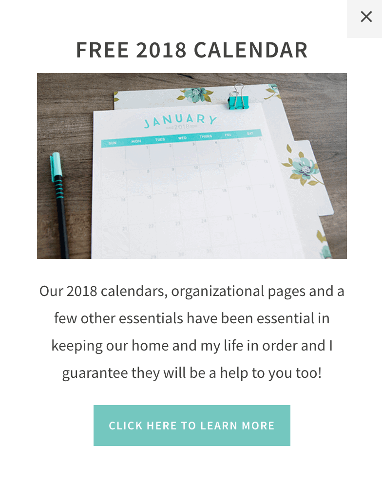
You might also add a sign up form to your site in the form of a slide in. These often show up in the bottom right corner after a specified amount of time or after scrolling.
I like slide ins because they’re not as annoying as popups while still calling attention to your sign up form.
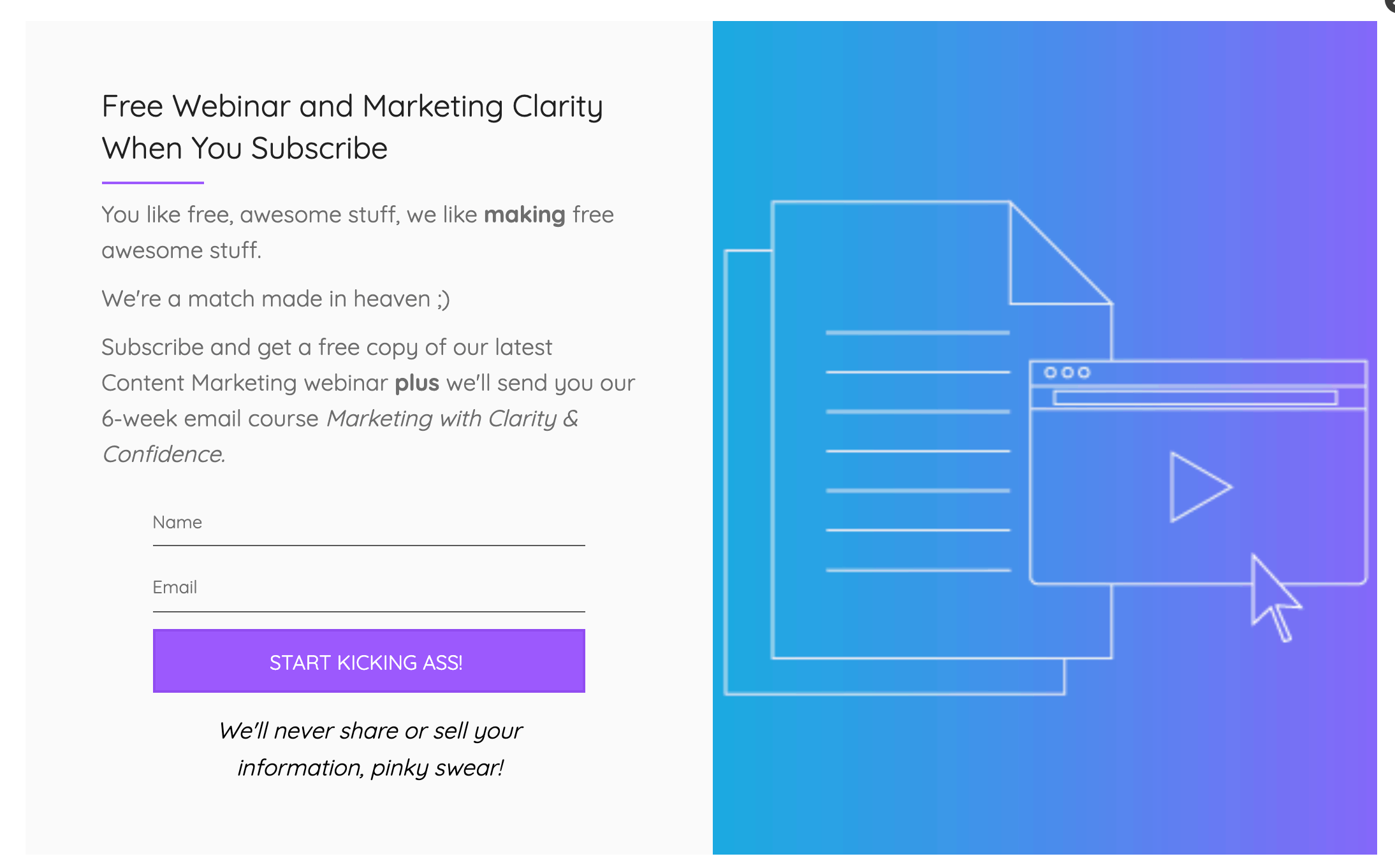
In both of these examples, we’re getting something in exchange for signing up — a free ebook and calendar. Of course we’ll be added to their main list as well (where we can unsubscribe if desired), but right away we’ll receive something valuable.
Takeaway: Offer something of value to the visitor in exchange for signing up.
Popup
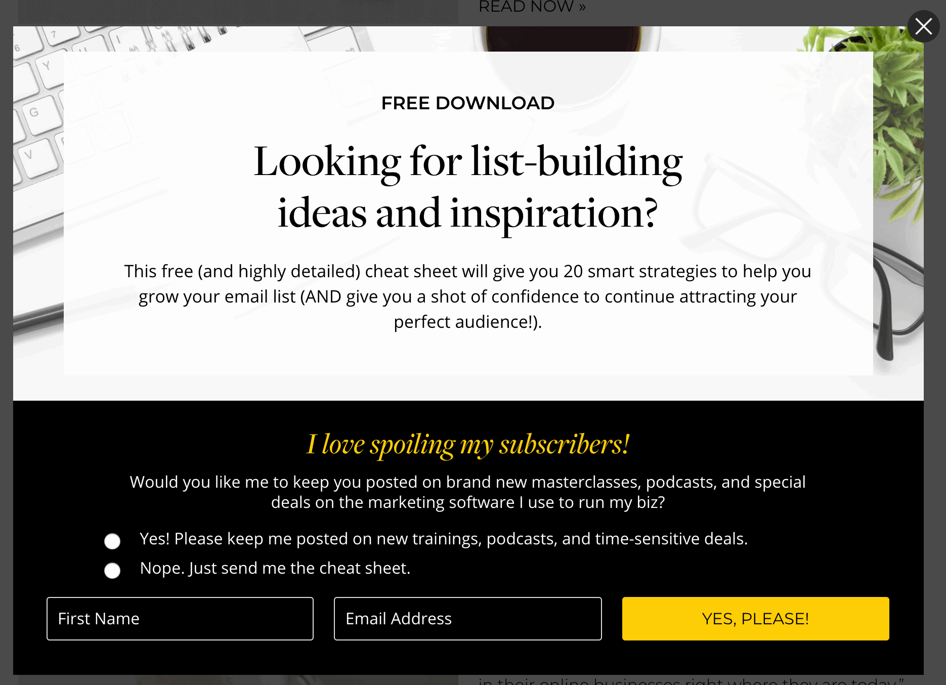
We all hate them, but they are effective. Consider using a popup to allow people to sign up for your list.
Like Skillcrush, I love Amy Porterfield because the free downloads are directly related to the post you’re reading.
Takeaway: Consider having multiple value-added freebies across your site, specific to the post they’re on.
Conclusion
There’s tons to learn by looking at how others include and structure their sign up forms. By following the tips above, you’ll be on your way to getting more people to sign up for your list.
P.S. This site is hilarious and you should really check it out.

